RippleDrawable
suggest changeRipple touch effect was introduced with material design in Android 5.0 (API level 21) and the animation is implemented by the new RippleDrawable class.
Drawable that shows a ripple effect in response to state changes. The anchoring position of the ripple for a given state may be specified by calling setHotspot(float x, float y) with the corresponding state attribute identifier.
In general, ripple effect for regular buttons works by default in API 21 and above, and for other touchable views, it can be achieved by specifying:
android:background="?android:attr/selectableItemBackground">for ripples contained within the view or:
android:background="?android:attr/selectableItemBackgroundBorderless"for ripples that extend beyond the view’s bounds.
For example, in the image below,
- B1 is a button that does not have any background,
- B2 is set up with
android:background="android:attr/selectableItemBackground" - B3 is set up with
android:background="android:attr/selectableItemBackgroundBorderless"
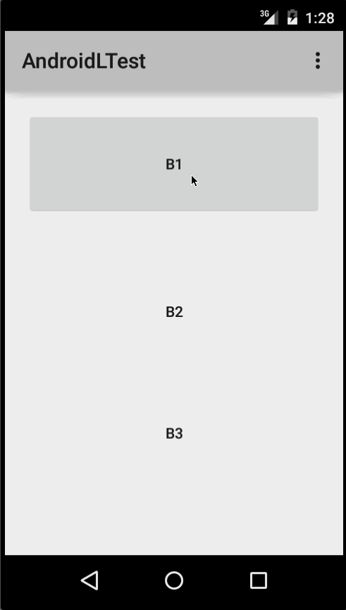
(Image courtesy: http://blog.csdn.net/a396901990/article/details/40187203 )
You can achieve the same in code using:
int[] attrs = new int[]{R.attr.selectableItemBackground};
TypedArray typedArray = getActivity().obtainStyledAttributes(attrs);
int backgroundResource = typedArray.getResourceId(0, 0);
myView.setBackgroundResource(backgroundResource);
Ripples can also be added to a view using the android:foreground attribute the same way as above. As the name suggests, in case the ripple is added to the foreground, the ripple will show up above any view it is added to (e.g. ImageView, a LinearLayout containing multiple views, etc).
If you want to customize the ripple effect into a view, you need to create a new XML file, inside the drawable directory.
Here are few examples:
Example 1: An unbounded ripple
<ripple xmlns:android="http://schemas.android.com/apk/res/android"
    android:color="#ffff0000" />
Example 2: Ripple with mask and background color
<ripple android:color="#7777777"
    xmlns:android="http://schemas.android.com/apk/res/android">
    <item android:id="@android:id/mask"
        android:drawable="#ffff00" />
    <item android:drawable="@android:color/white"/>
</ripple>
If there is view with a background already specified with a shape, corners and any other tags, to add a ripple to that view use a mask layer and set the ripple as the background of the view.
Example:
<?xml version="1.0" encoding="utf-8"?>
   <ripple xmlns:android="http://schemas.android.com/apk/res/android"
       android:color="?android:attr/colorControlHighlight">
       <item android:id="@android:id/mask">
          <shape
             android:shape="rectangle">
             solid android:color="#000000"/>
              <corners
                android:radius="25dp"/>
           </shape>
       </item>
       <item android:drawable="@drawable/rounded_corners" />
   </ripple>
Example 3: Ripple on top a drawable resource
<ripple xmlns:android="http://schemas.android.com/apk/res/android"
    android:color="#ff0000ff">
    <item android:drawable="@drawable/my_drawable" />
</ripple>
Usage: To attach your ripple xml file to any view, set it as background as following (assuming your ripple file is named my_ripple.xml):
<View
    android:id="@+id/myViewId"
    android:layout_width="wrap_content"
    android:layout_height="wrap_content"
    android:background="@drawable/my_ripple" />
Selector:
The ripple drawable can also be used in place of color state list selectors if your target version is v21 or above (you can also place the ripple selector in the drawable-v21 folder):
<!-- /drawable/button.xml: -->
<selector xmlns:android="http://schemas.android.com/apk/res/android">
    <item android:state_pressed="true" android:drawable="@drawable/button_pressed"/>
    <item android:drawable="@drawable/button_normal"/>
</selector>

<!--/drawable-v21/button.xml:-->
<?xml version="1.0" encoding="utf-8"?>
<ripple xmlns:android="http://schemas.android.com/apk/res/android"
    android:color="?android:colorControlHighlight">
   <item android:drawable="@drawable/button_normal" />
</ripple>
In this case, the color of the default state of your view would be white and the pressed state would show the ripple drawable.
Point to note: Using ?android:colorControlHighlight will give the ripple the same color as the built-in ripples in your app.
To change just the ripple color, you can customize the color android:colorControlHighlight in your theme like so:
<?xml version="1.0" encoding="utf-8"?>
<resources>

  <style name="AppTheme" parent="android:Theme.Material.Light.DarkActionBar">
    <item name="android:colorControlHighlight">@color/your_custom_color</item>
  </style>

</resources>
and then use this theme in your activities, etc. The effect would be like the image below:
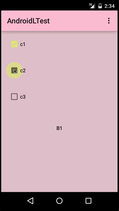
(Image courtesy: http://blog.csdn.net/a396901990/article/details/40187203 )