Background Size
suggest changeGeneral overview
The background-size property enables one to control the scaling of the background-image. It takes up to two values, which determine the scale/size of the resulting image in vertical and and horizontal direction. If the property is missing, its deemed auto in both width and height.
auto will keep the image’s aspect ratio, if it can be determined. The height is optional and can be considered auto. Therefore, on a 256 px × 256 px image, all the following background-size settings would yield an image with height and width of 50 px:
background-size: 50px;
background-size: 50px auto; /* same as above */
background-size: auto 50px;
background-size: 50px 50px;
So if we started with the following picture (which has the mentioned size of 256 px × 256 px),
we’ll end up with a 50 px × 50 px on the user’s screen, contained in the background of our element:

One can also use percentage values to scale the image with respect of the element. The following example would yield a 200 px × 133 px drawn image:
#withbackground {
    background-image: url(to/some/background.png);

    background-size: 100% 66%;

    width: 200px;
    height: 200px;
		padding: 0;
		margin: 0;
}
The behaviour depends on the background-origin.
Keeping the aspect ratio
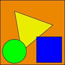
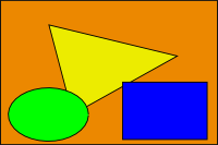
The last example in the previos section lost its original aspect ratio. The circle got into an ellipse, the square into a rectangle, the triangle into another triangle.
The length or percentage approach isn’t flexible enough to keep the aspect ratio at all times. auto doesn’t help, since you might not know which dimension of your element will be larger. However, to cover certain areas with an image (and correct aspect ratio) completely or to contain an image with correct aspect ratio completely in a background area, the values, contain and cover provide the additional functionality.
Eggsplanation for contain and cover
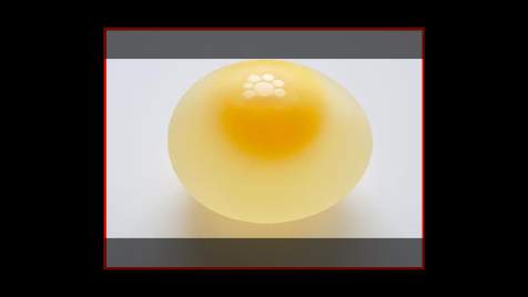
Sorry for the bad pun, but we’re going to use a picture of the day by Biswarup Ganguly for demonstration. Lets say that this is your screen, and the gray area is outside of your visible screen. For demonstration, We’re going to assume a 16 × 9 ratio.

We want to use the aforementioned picture of the day as a background. However, we cropped the image to 4x3 for some reason. We could set the background-size property to some fixed length, but we will focus on contain and cover. Note that I also assume that we didn’t mangle the width and/or height of body.
contain
Scale the image, while preserving its intrinsic aspect ratio (if any), to the
This makes sure that the background image is always completely contained in the background positioning area, however, there could be some empty space filled with your `background-color` in this case:
Scale the image, while preserving its intrinsic aspect ratio (if any), to the smallest size such that both its width and its height can completely cover the background positioning area.
This makes sure that the background image is covering everything. There will be no visible background-color, however depending on the screen’s ratio a great part of your image could be cut off:
Demonstration with actual code
div > div {
  background-image: url(http://i.stack.imgur.com/r5CAq.jpg);
  background-repeat: no-repeat;
  background-position: center center;
  background-color: #ccc;
  border: 1px solid;
  width: 20em;
  height: 10em;
}
div.contain {
  background-size: contain;
}
div.cover {
  background-size: cover;
}
/********************************************
 Additional styles for the explanation boxes
*********************************************/

div > div {
  margin: 0 1ex 1ex 0;
  float: left;
}
div + div {
  clear: both;
  border-top: 1px dashed silver;
  padding-top:1ex;
}
div > div::after {
  background-color: #000;
  color: #fefefe;
  margin: 1ex;
  padding: 1ex;
  opacity: 0.8;
  display: block;
  width: 10ex;
  font-size: 0.7em;
  content: attr(class);
}<div>
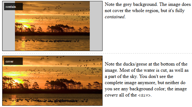
<div class="contain"></div>
<p>Note the grey background. The image does not cover the whole region, but it's fully <em>contained</em>.
</p>
</div>
<div>
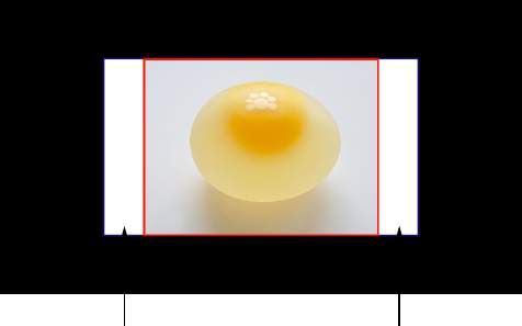
<div class="cover"></div>
<p>Note the ducks/geese at the bottom of the image. Most of the water is cut, as well as a part of the sky. You don't see the complete image anymore, but neither do you see any background color; the image <em>covers</em> all of the <code><div></code>.</p>
</div>