Clipping and Masking Overview and Difference
suggest changeWith Clipping and Masking you can make some specified parts of elements transparent or opaque. Both can be applied to any HTML element.
Clipping
Clips are vector paths. Outside of this path the element will be transparent, inside it's opaque. Therefore you can define a clip-path property on elements. Every graphical element that also exists in SVG you can use here as a function to define the path. Examples are circle(), polygon() or ellipse().
Example
clip-path: circle(100px at center);The element will be only visible inside of this circle, which is positioned at the center of the element and has a radius of 100px.
Masking
Masks are similar to Clips, but instead of defining a path you define a mask what layers over the element. You can imagine this mask as an image what consist of mainly two colors: black and white.
Luminance Mask: Black means the region is opaque, and white that it's transparent, but there is also a grey area which is semi-transparent, so you are able to make smooth transitions.
Alpha Mask: Only on the transparent areas of the mask the element will be opaque.
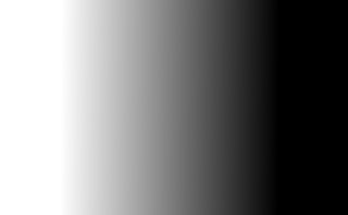
This image for example can be used as a luminance mask to make for an element a very smooth transition from right to left and from opaque to transparent.
The mask property let you specify the the mask type and an image to be used as layer.
Example
mask: url(masks.svg#rectangle) luminance;An element called rectangle defined in masks.svg will be used as an luminance mask on the element.