Compass pointer or needle shape using 3D transforms
suggest changeCSS
div.needle {
  margin: 100px;
  height: 150px;
  width: 150px;
  transform: rotateY(85deg) rotateZ(45deg);
  /* presentational */
  background-image: linear-gradient(to top left, #555 0%, #555 40%, #444 50%, #333 97%);
  box-shadow: inset 6px 6px 22px 8px #272727;
}
HTML
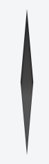
<div class='needle'></div>In the above example, a needle or compass pointer shape is created using 3D transforms. Generally when we apply the rotate transform on an element, the rotation happens only in the Z-axis and at best we will end up with diamond shapes only. But when a rotateY transform is added on top of it, the element gets squeezed in the Y-axis and thus ends up looking like a needle. The more the rotation of the Y-axis the more squeezed the element looks.
The output of the above example would be a needle resting on its tip. For creating a needle that is resting on its base, the rotation should be along the X-axis instead of along Y-axis. So the transform property’s value would have to be something like rotateX(85deg) rotateZ(45deg);.
This pen uses a similar approach to create something that resembles the Safari logo or a compass dial.
Screenshot of element with no transform:

Screenshot of element with only 2D transform:

Screenshot of element with 3D transform: