Cube
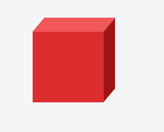
suggest changeThis example shows how to create a cube using 2D transformation methods skewX() and skewY() on pseudo elements.
HTML:
<div class="cube"></div>CSS:
.cube {
  background: #dc2e2e;
  width: 100px;
  height: 100px;
  position: relative;
  margin: 50px;
}

.cube::before {
  content: '';
  display: inline-block;
  background: #f15757;
  width: 100px;
  height: 20px;
  transform: skewX(-40deg);
  position: absolute;
  top: -20px;
  left: 8px;
}

.cube::after {
  content: '';
  display: inline-block;
  background: #9e1515;
  width: 16px;
  height: 100px;
  transform: skewY(-50deg);
  position: absolute;
  top: -10px;
  left: 100%;
}
Found a mistake? Have a question or improvement idea?
Let me know.
Table Of Contents