Optimally fit elements to their container
suggest changeOne of the nicest features of flexbox is to allow optimally fitting containers to their parent element.
HTML:
<div class="flex-container">
  <div class="flex-item">1</div>
  <div class="flex-item">2</div>
  <div class="flex-item">3</div>
  <div class="flex-item">4</div>
  <div class="flex-item">5</div>
</div>
CSS:
.flex-container {
background-color: #000;
height: 100%;
display:flex;
flex-direction: row;
flex-wrap: wrap;
justify-content: flex-start;
align-content: stretch;
align-items: stretch;
}
.flex-item {
background-color: #ccf;
margin: 0.1em;
flex-grow: 1;
flex-shrink: 0;
flex-basis: 200px; /* or % could be used to ensure a specific layout */
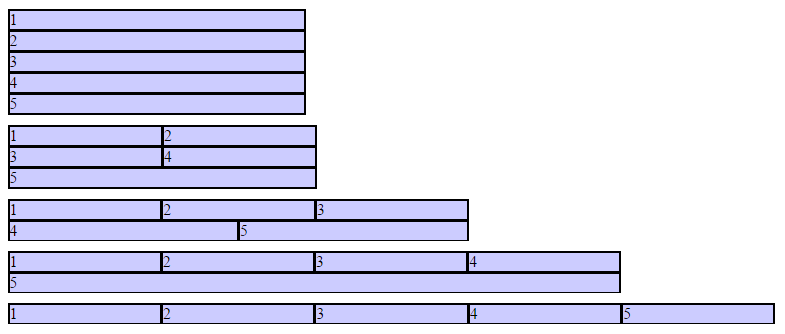
}Outcome:
Columns adapt as screen is resized.
Found a mistake? Have a question or improvement idea?
Let me know.
Table Of Contents