Using masks to create images with irregular shapes
suggest changeCSS
div { /* check remarks before usage */
  height: 200px;
  width: 400px;
  background-image: url(http://lorempixel.com/400/200/nature/4);
  mask-image: linear-gradient(to top right, transparent 49.5%, white 50.5%), linear-gradient(to top left, transparent 49.5%, white 50.5%), linear-gradient(white, white);
  mask-size: 75% 25%, 25% 25%, 100% 75%;
  mask-position: bottom left, bottom right, top left;
  mask-repeat: no-repeat;
}
HTML
<div></div>In the above example, three linear-gradient images (which when placed in their appropriate positions would cover 100% x 100% of the container’s size) are used as masks to produce a transparent triangular shaped cut at the bottom of the image.
Image without the mask:
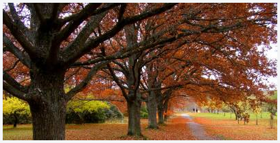
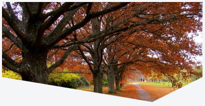
Image with the mask:
Found a mistake? Have a question or improvement idea?
Let me know.
Table Of Contents