using percent
suggest changeOne of the useful unit when creating a responsive application.
Its size depends on its parent container.
Equation:
( Parent Container`s width ) * ( Percentage(%) ) = Output
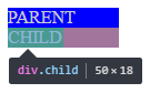
For Example:
Parent has 100px width while the Child has 50%.
On the output, the Child’s width will be half(50%) of the Parent’s, which is 50px.
HTML
<div class="parent">
   PARENT
   <div class="child">
     CHILD
   </div>
</div>
CSS
<style>

*{
  color: #CCC;
}

.parent{
  background-color: blue;
  width: 100px;
}

.child{
  background-color: green;
  width: 50%;
}

</style>
OUTPUT
Found a mistake? Have a question or improvement idea?
Let me know.
Table Of Contents