With media queries
suggest changeYou can re-set variables within media queries and have those new values cascade wherever they are used, something that isn’t possible with pre-processor variables.
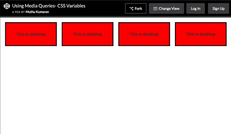
Here, a media query changes the variables used to set up a very simple grid:
HTML
<div></div>
<div></div>
<div></div>
<div></div>
CSS
:root{
    --width: 25%;
    --content: 'This is desktop';
}
@media only screen and (max-width: 767px){
    :root{
        --width:50%;
        --content: 'This is mobile';
    }
}
@media only screen and (max-width: 480px){
    :root{
        --width:100%;
    }
}

div{
    width: calc(var(--width) - 20px);
    height: 100px;
}
div:before{
    content: var(--content);
}

/* Other Styles */
body {
    padding: 10px;
}

div{
    display: flex;
    align-items: center;
    justify-content: center;
    font-weight:bold;
    float:left;
    margin: 10px;
    border: 4px solid black;
    background: red;
}
You can try resizing the window in this CodePen Demo
Here’s an animated screenshot of the resizing in action:
Found a mistake? Have a question or improvement idea?
Let me know.
Table Of Contents